Executive Search
Associates
A collaborative website redesign for a career coaching and executive search firm — updating the visual identity with an earthy, inviting palette while working closely with a client who had her own strong design sensibility.
Problem & Solution
Explore the Process
Outcomes
What Was Used
Industry-standard tools and a structured collaborative process — from client discovery and site audit through to an iteratively co-created, WCAG-compliant final design.
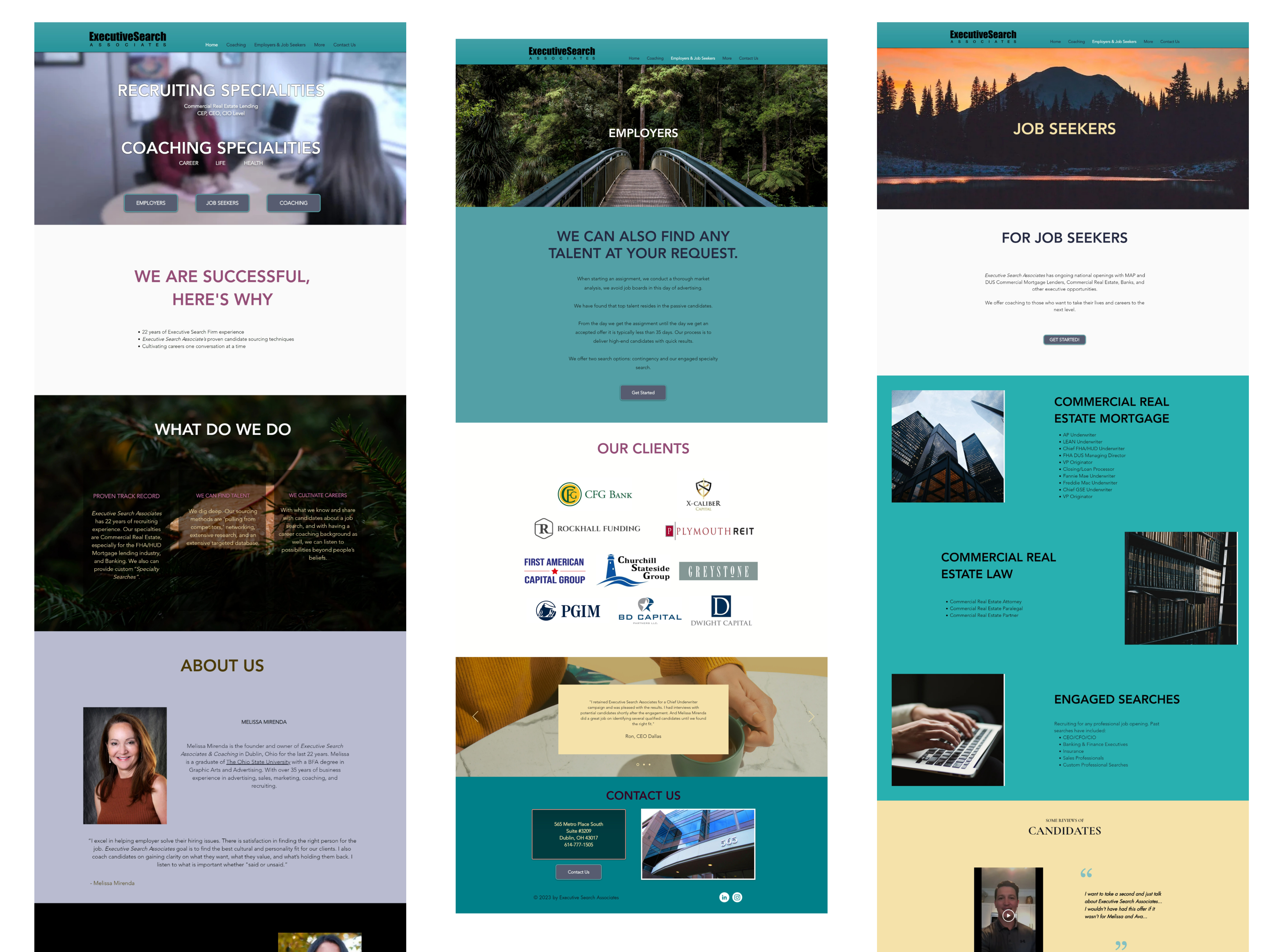
The starting point for this project was a series of in-depth conversations with the client — not just about what she wanted the site to look like, but about who her clients were, what transformation she helped them achieve, and how she wanted to be perceived in the market. Three distinct service areas emerged: executive search placement, career coaching for mid-level professionals, and life coaching for individuals navigating major transitions. All three needed equal representation on the site.
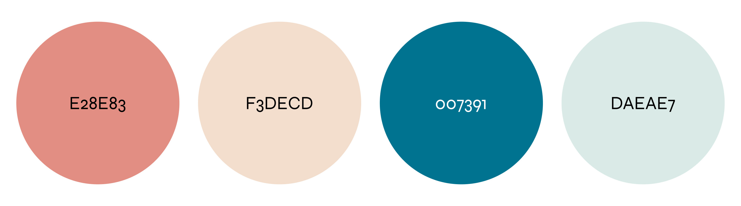
The original site was audited for content structure, visual hierarchy, readability, and accessibility. Key findings: the primary navigation prioritised executive search above all else, making the life coaching and career guidance services nearly invisible to first-time visitors. The colour palette was neutral to the point of feeling generic, and the typography lacked personality — it felt like a template rather than a personal brand.
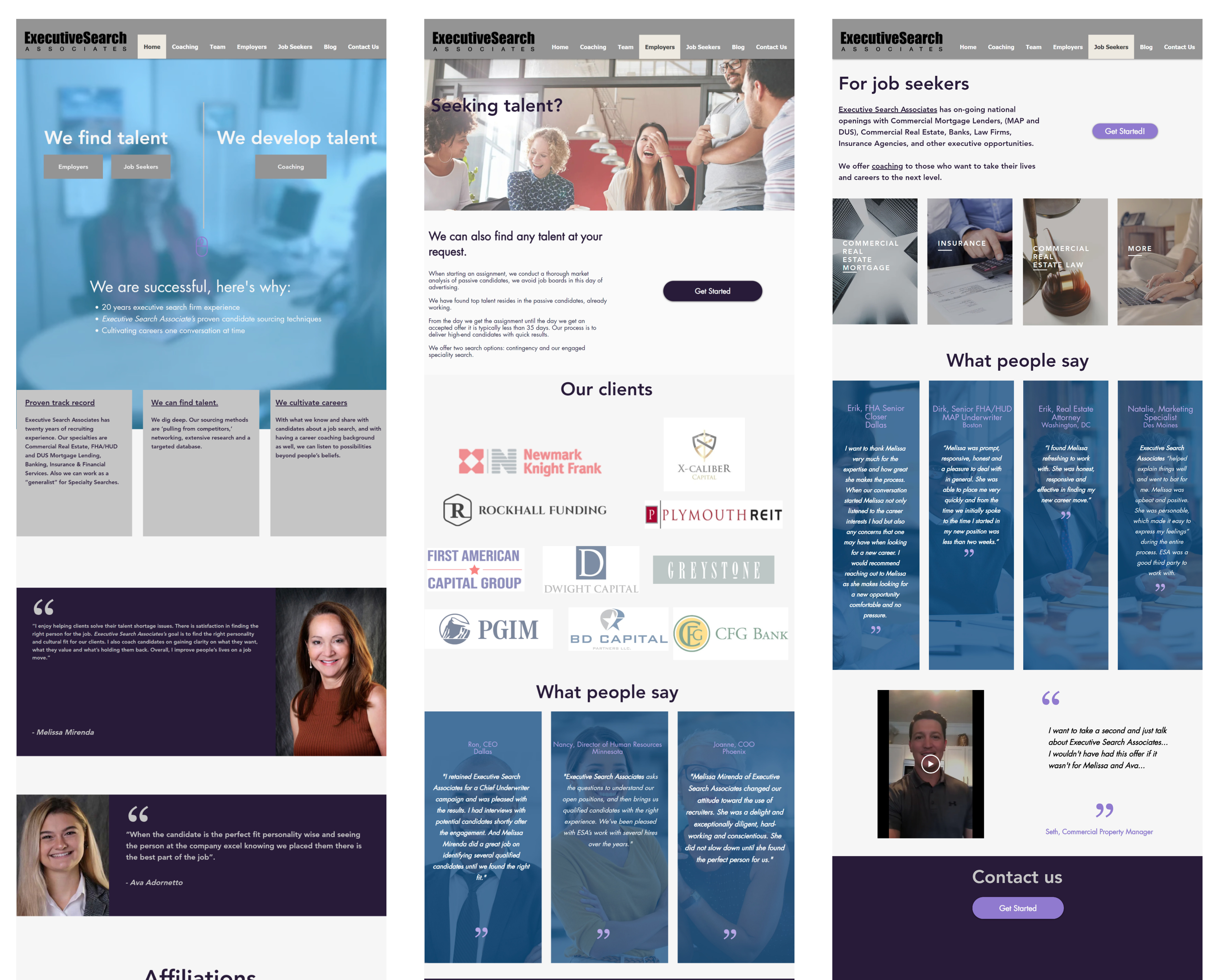
Several comparable career coaching and executive search websites were reviewed. The pattern across competitors was a split between two extremes: overly formal corporate sites that felt cold and transactional, and overly casual personal brand sites that lacked professional credibility. The gap — and the opportunity — was a site that was simultaneously warm, human, professional, and distinctive. That became the design brief.
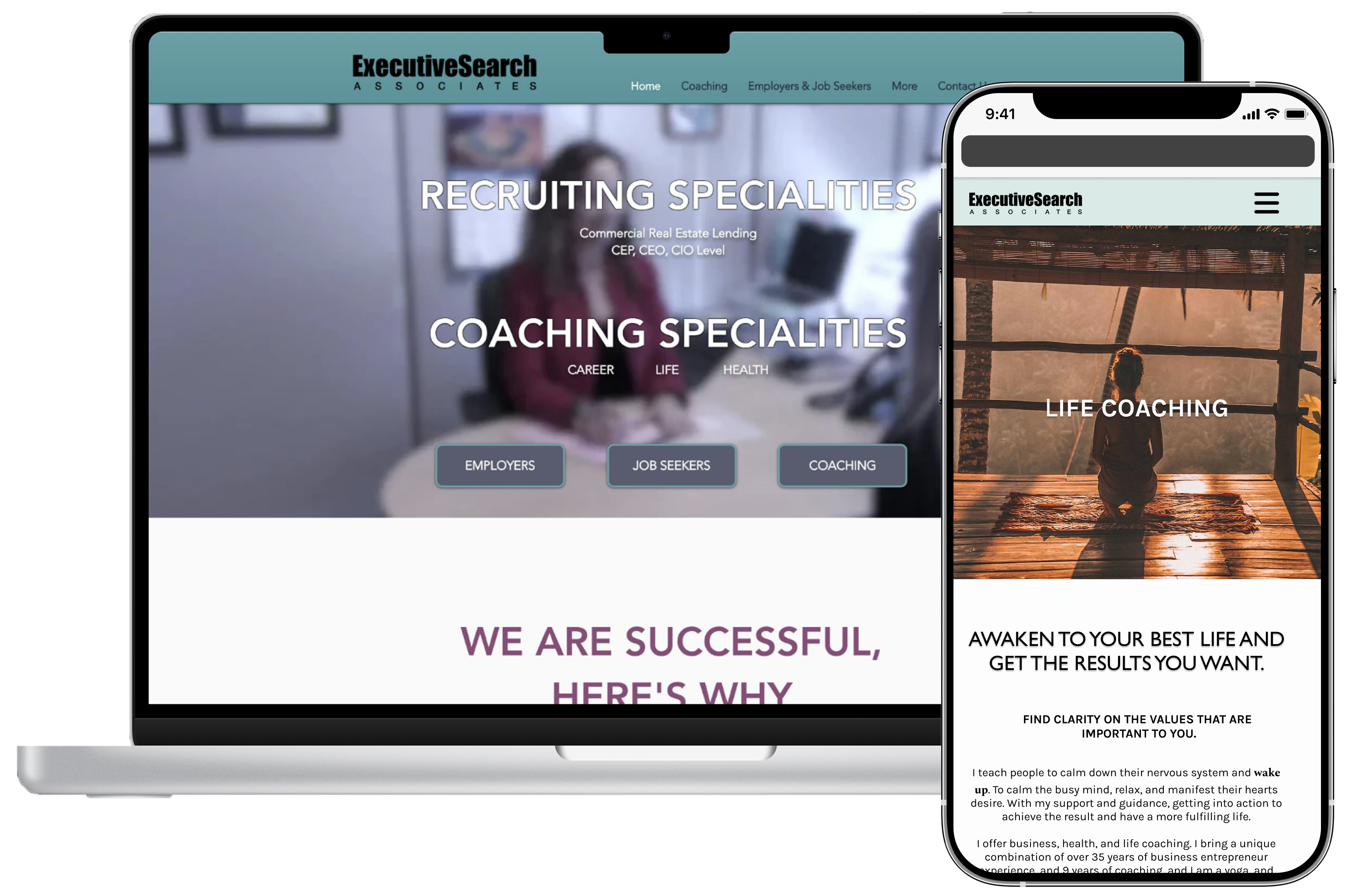
Typography consumed a disproportionate amount of this project's time — and rightly so. Because the client had a design background, she had strong instincts about how type should feel. Several rounds of iteration were needed before arriving at a pairing that fully represented her brand. The process reinforced a clear lesson: when working with a design-literate client, showing the reasoning behind each typographic choice is as important as the choice itself.