Design Process Overview
Step 01
Constraints
Hard rules before sketching
Step 02
Sketches
Multiple layout options
Step 03
Style Guide
Accessible colour + type
Step 04
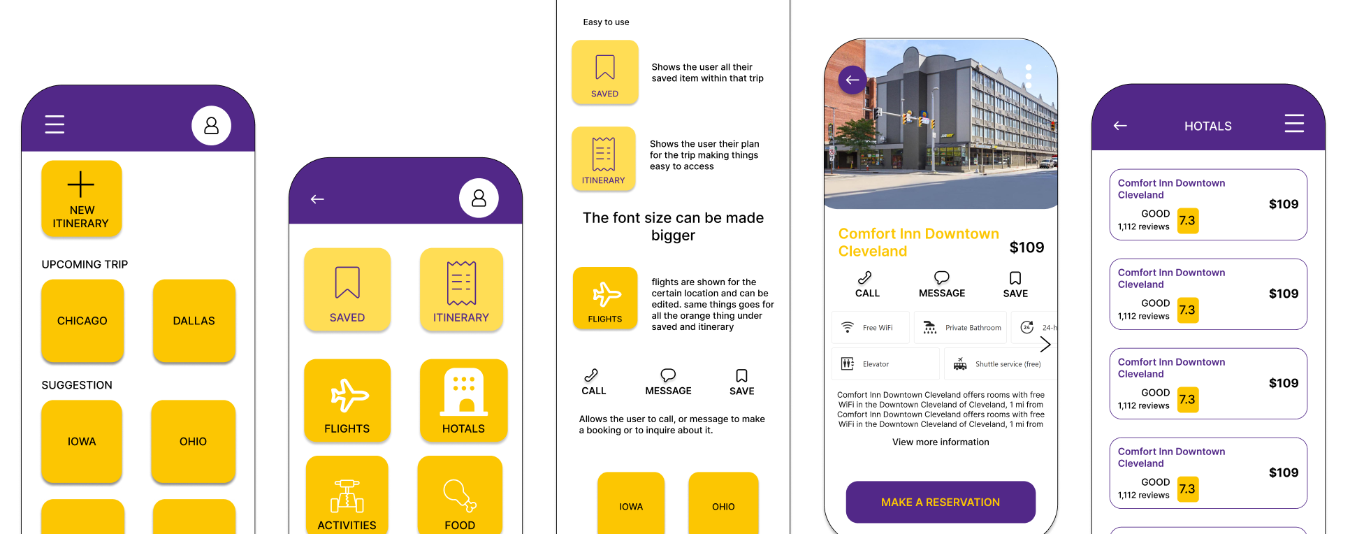
Wireframes
≤3 taps to every goal
Hard Design Constraints — Set Before Any Sketching
Based on research into how the Silent Generation interacts with digital interfaces, four non-negotiable constraints were established before a single screen was sketched. Any design that violated them was rejected regardless of visual quality.
Constraint 01
Maximum 3 Taps to Any Goal
Every core task — view itinerary, add booking, message a group member — must be reachable within 3 taps from home. Research shows completion rates drop sharply when navigation depth exceeds 3 levels for users aged 65+.
Constraint 02
48px Minimum Touch Targets
All tappable elements are at least 48x48px — WCAG AA minimum — to accommodate reduced fine motor precision. Icons are always accompanied by text labels. No icon-only navigation exists anywhere in the app.
Constraint 03
Portrait Orientation Only
Landscape mode is disabled throughout. Older users rarely rotate their phones intentionally and become disoriented when layout shifts unexpectedly. The entire app is designed and optimised for portrait only.
Constraint 04
Humanised Error Messages
Every error state is written in plain conversational language. "Something went wrong" is replaced with "We couldn't load your itinerary — tap here and we'll try again." Every message was tested by reading it aloud to verify it sounded like something said to an older relative, not a system log.
Sketch Explorations
.jpg)
Sketches — navigation and group creation flows
.JPG)
Sketches — itinerary and booking confirmation screens
Multiple sketch rounds explored different approaches to the group creation flow — the feature most unique to Journey. Early sketches placed group management in a separate settings area, but persona research showed the group view should be the home screen itself. For the Silent Generation, seeing familiar travel companions' names immediately on opening the app provides orientation and emotional reassurance before any other interaction.
Style Guide — Accessible Colour System

Colour & Type Decisions
Warm White Background — Primary background throughout the app. Not pure white (#FFFFFF) — slightly warmer to reduce glare fatigue for users with age-related light sensitivity. The warm undertone creates a softer, more comfortable reading experience during extended use.
Primary Yellow — Used for primary actions like "Add Booking," "Create Group," and "Share Itinerary" buttons. Highly visible across different lighting conditions and remains legible for users with reduced color perception. Signals forward progress and positive actions.
Dark Gold Accent — Secondary accent for hover states, active selections, and emphasis text. Provides 5.8:1 contrast against warm white (exceeds WCAG AA). Maintains visual continuity with primary yellow while offering better readability for smaller text elements.
Primary Purple — Navigation elements, icons, and section headers. Purple chosen for its association with wisdom and experience — culturally appropriate for older adults. Provides 4.7:1 contrast on white backgrounds, meeting WCAG AA standards.
Deep Purple — Darker UI elements like bottom navigation backgrounds, card shadows, and secondary text. Creates visual depth without harsh black. Slightly warmer tone reduces eye strain during extended reading sessions.
Near Black — Body text and high-emphasis content only. Provides maximum contrast (18.5:1 ratio on #FAF9F9) for critical information like booking confirmations, times, addresses, and important instructions. Used sparingly to maintain focus.
Critical Design Decisions
Decision 01 — Progressive Disclosure
The default experience shows the simplified view — core information only, no advanced options visible. An optional "More options" toggle reveals filtering, customisation, and advanced booking tools. Dorothy (group organiser persona) sees exactly what she needs; a tech-confident companion in the group accesses the full feature set without the interface feeling simplified for them.
Decision 02 — Roadblocks Before Purchases
A dedicated confirmation screen appears before every financial action: what's being purchased, the total cost, and a prominent back option. Designed to feel like a helpful pause, not an obstacle. This directly addresses the Silent Generation's most consistently cited barrier to digital transactions — fear of making an accidental or irreversible purchase.
Decision 03 — Share Works for Non-App Users
The share itinerary function sends a formatted PDF link via SMS — viewable in any mobile browser without installing the app. This accommodates group members who aren't ready to adopt the app but still need access to the shared travel plan. Group participation doesn't require full app adoption.
User Interface Principles
Every UI decision was made with the Silent Generation's physical and cognitive capabilities in mind. These principles were applied consistently across all screens to create a predictable, learnable interface.
Navigation
Bottom Menu Bar
All primary navigation is placed at the bottom of the screen within easy thumb reach. Research shows older users often use one hand to hold their phone, making bottom-placed controls significantly more accessible than top navigation. The menu is persistent across all screens with text labels — no icon-only navigation.
Wayfinding
Back Button + Breadcrumbs
A visible back button appears at the top left of every screen that isn't the home screen. Breadcrumbs show the path taken to reach the current screen, helping users understand where they are in the app's hierarchy. This addresses the disorientation that older users often experience in deep navigation flows.
Notifications
Limited & Contextual
Notifications are limited to trip-critical updates only — flight changes, booking confirmations, and group messages. No promotional notifications, no engagement reminders. Each notification includes a one-tap action (e.g., "View updated itinerary") rather than just informing the user of a change.
Orientation
Portrait Only
The app is locked to portrait orientation throughout. Landscape mode is disabled to prevent accidental rotation and the resulting disorientation. Older users rarely rotate their phones intentionally, and layout shifts can be confusing when they occur unexpectedly during normal use.
Sharing
One-Tap Share Icon
A prominent share icon appears on itinerary screens, allowing users to send the travel plan to group members via SMS or email with a single tap. The shared content is a formatted PDF viewable in any browser — no app installation required for recipients.
Behavior Patterns
The app implements specific behavior patterns designed to accommodate varying levels of digital confidence while maintaining full functionality for all users.
Pattern 01
Progressive Disclosure
The default interface shows a simplified version of the app with only essential features visible. An optional "More options" toggle reveals advanced features like filtering, customization, and detailed booking management. This allows Dorothy (the group organizer persona) to see exactly what she needs, while a tech-confident companion in the same group can access the full feature set without the interface feeling dumbed down.
Pattern 02
Search Suggestions
When users begin typing a destination, the app provides destination suggestions based on popular travel locations and past searches. Suggestions include small preview images and brief descriptions (e.g., "Paris, France — Popular for museums and cafés") to help users recognize the correct destination without needing to type the full name or spell it perfectly.
Pattern 03
Exploration Without Commitment
Users can browse destinations, view sample itineraries, and explore booking options without creating an account or providing any personal information. Only when they're ready to save an itinerary or make a booking does the app request login. This reduces the initial barrier to entry and allows hesitant users to build confidence before committing.
Secondary Actions & Error Handling
How the app responds to user mistakes and uncertainty is critical for building trust with the Silent Generation. These patterns ensure users feel supported, not punished, when errors occur.
Handling Errors
Humanized Error Messages
Every error message is written in plain conversational language and tested by reading it aloud. "Error 404: Resource not found" becomes "We couldn't load your itinerary — tap here and we'll try again." Messages explain what happened and what to do next, never just announcing that something went wrong without guidance.
Undo & Cancel
30-Second Undo Window
Any edit to an itinerary can be undone within 30 seconds — a toast notification appears at the bottom of the screen with "Undo" in large, tappable text. This addresses the Silent Generation's fear of making irreversible mistakes. Users learn quickly that the app allows exploration without permanent consequences.
Navigation History
Session Recovery
If the app is backgrounded or closed during a task, the user returns to exactly where they left off when reopening — the navigation stack is preserved. This prevents the frustration of losing progress and having to start over, which is a common abandonment point for older users.
Purchase Roadblock
Confirmation Before Payment
Before any purchase, a dedicated confirmation screen appears showing: what's being purchased, the total cost, and a large "Back" button. This roadblock is designed to feel like a helpful pause rather than an obstacle. It directly addresses the Silent Generation's most consistently cited barrier to digital transactions — fear of accidental or irreversible purchases.